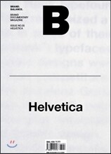

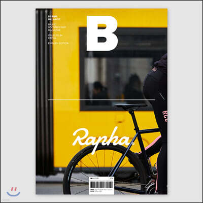
![매거진 B (월간) : 4월 영문판 [2015년]](https://image.yes24.com/Goods/24813768/S)
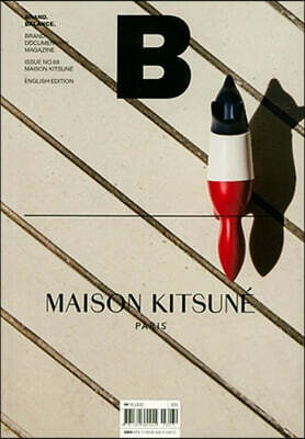
![매거진 B (월간) : 4월 영문판 [2015년]](https://image.yes24.com/goods/24813768/XL)
- 표지 스크래치, 내지 잉크 튐은 제작 과정 중 자연스럽게 발생할 수 있어 교환 대상이 아닙니다.
이미 소장하고 있다면 판매해 보세요.
- 국내배송만 가능
- 문화비소득공제 가능
이 상품의 시리즈 198
![매거진 F (격월) : 3월 영문판 [2024년]](https://image.yes24.com/Goods/126804059/L)
![매거진 B : No.39 Breville 브레빌 국문판 [2022]](https://image.yes24.com/Goods/112233622/L)
![매거진 B : No.16 Aesop 에이솝 국문판 [2022]](https://image.yes24.com/Goods/111100708/L)



![매거진 B (월간) : 7, 8월 국문판 [2019년]](https://image.yes24.com/Goods/76894194/L)
![매거진 B (월간) : 6월 국문판 [2019년]](https://image.yes24.com/Goods/74315893/L)
![매거진 B (월간) : 5월 국문판 [2019년]](https://image.yes24.com/Goods/73047293/L)
![매거진 B (월간) : 4월 국문판 [2019년]](https://image.yes24.com/Goods/72121823/L)
![매거진 B (월간) : 3월 국문판 [2019년]](https://image.yes24.com/Goods/70921242/L)
![매거진 B (월간) : 1,2월 국문판 [2019년]](https://image.yes24.com/Goods/69310511/L)
![매거진 B (월간) : 12월 국문판 [2018년]](https://image.yes24.com/Goods/67513299/L)
![매거진 B (월간) : 11월 국문판 [2018년]](https://image.yes24.com/Goods/66916206/L)
![매거진 B (월간) : 10월 국문판 [2018년]](https://image.yes24.com/Goods/65447464/L)
![매거진 B (월간) : 9월 국문판 [2018년]](https://image.yes24.com/Goods/64341113/L)
![매거진 B (월간) : 7월 영문판 [2018년]](https://image.yes24.com/Goods/69505570/L)
![매거진 B (월간) : 7,8월 합본호 국문판 [2018년]](https://image.yes24.com/Goods/62199157/L)
![매거진 B (월간) : 6월 국문판 [2018년]](https://image.yes24.com/Goods/61387625/L)
![매거진 B : No.65 LE LABO 영문판 [2018]](https://image.yes24.com/Goods/149676523/L)
![매거진 B (월간) : 5월 국문판 [2018년]](https://image.yes24.com/Goods/60744440/L)
![매거진 B (월간) : 4월 영문판 [2018년]](https://image.yes24.com/Goods/60513594/L)
![매거진 B (월간) : 4월 [2018년]](https://image.yes24.com/Goods/59658653/L)
![매거진 B (월간) : 3월 영문판 [2018년]](https://image.yes24.com/Goods/59400137/L)
![매거진 B (월간) : 3월 [2018년]](https://image.yes24.com/Goods/59158799/L)
![매거진 B (월간) : 2월 영문판 [2018년]](https://image.yes24.com/Goods/58478809/L)
![매거진 B (월간) : 1,2월 [2018년]](https://image.yes24.com/Goods/58074709/L)
![매거진 B (월간) : 12월 영문판 [2017년]](https://image.yes24.com/Goods/57914973/L)
![매거진 B (월간) : 12월 [2017년]](https://image.yes24.com/Goods/57572010/L)
![매거진 B (월간) : 11월 영문판 [2017년]](https://image.yes24.com/Goods/57503422/L)
![매거진 B (월간) : 11월 [2017년]](https://image.yes24.com/Goods/56682896/L)
![매거진 B (월간) : 10월 영문판 [2017년]](https://image.yes24.com/Goods/55998041/L)
![매거진 B (월간) : 10월 [2017년]](https://image.yes24.com/Goods/53232680/L)
![매거진 B (월간) : 9월 영문판 [2017년]](https://image.yes24.com/Goods/50263862/L)
![매거진 B (월간) : 9월 [2017년]](https://image.yes24.com/Goods/45546468/L)
![매거진 B (월간) : 7월 영문판 [2017년]](https://image.yes24.com/Goods/44275430/L)
![매거진 B (월간) : 7,8월 [2017년]](https://image.yes24.com/Goods/43870035/L)
![매거진 B (월간) : 6월 영문판 [2017년]](https://image.yes24.com/Goods/43620247/L)
![매거진 B (월간) : 6월 [2017년]](https://image.yes24.com/Goods/42493396/L)
![매거진 B (월간) : 5월 [2017년]](https://image.yes24.com/Goods/40144365/L)
![매거진 B (월간) : 4월 영문판 [2017년]](https://image.yes24.com/Goods/39002663/L)
![매거진 B (월간) : 4월 [2017년]](https://image.yes24.com/Goods/38880813/L)
![매거진 B (월간) : 3월 영문판 [2017년]](https://image.yes24.com/Goods/37252051/L)
![매거진 B (월간) : 3월 [2017년]](https://image.yes24.com/Goods/37007457/L)
![매거진 B (월간) : 2월 영문판 [2017년]](https://image.yes24.com/Goods/37009698/L)
![매거진 B (월간) : 1,2월 [2017년]](https://image.yes24.com/Goods/35121164/L)
![매거진 B (월간) : 12월 [2016년]](https://image.yes24.com/Goods/33713933/L)
![매거진 B (월간) : 11월 영문판 [2016년]](https://image.yes24.com/Goods/35219445/L)
![매거진 B (월간) : 11월 [2016년]](https://image.yes24.com/Goods/33179955/L)
![매거진 B (월간) : 10월 영문판 [2016년]](https://image.yes24.com/Goods/35219443/L)
![매거진 B (월간) : 10월 [2016년]](https://image.yes24.com/Goods/32542292/L)
![매거진 B (월간) : 9월 영문판 [2016년]](https://image.yes24.com/Goods/35219424/L)
![매거진 B (월간) : 9월 [2016년]](https://image.yes24.com/Goods/30743139/L)
![매거진 B TRAVEL PACKAGE [2016년]](https://image.yes24.com/Goods/30393008/L)
![매거진 B (월간) : 7월 영문판 [2016년]](https://image.yes24.com/Goods/35219417/L)
![매거진 B (월간) : 7,8월 합본판 [2016년]](https://image.yes24.com/Goods/29254901/L)
![매거진 B (월간) : 6월 영문판 [2016년]](https://image.yes24.com/Goods/35219413/L)
![매거진 B (월간) : 6월 [2016년]](https://image.yes24.com/Goods/28060764/L)
![매거진 B (월간) : 5월 영문판 [2016년]](https://image.yes24.com/Goods/35219409/L)
![매거진 B (월간) : 5월 [2016년]](https://image.yes24.com/Goods/27066931/L)
![매거진 B (월간) : 4월 영문판 [2016년]](https://image.yes24.com/Goods/35219405/L)
![매거진 B (월간) : 4월 [2016년]](https://image.yes24.com/Goods/25551515/L)
![매거진 B (월간) : 3월 영문판 [2016년]](https://image.yes24.com/Goods/24814050/L)
![매거진 B (월간) : 3월 [2016년]](https://image.yes24.com/Goods/24725358/L)
![매거진 B (월간) : 1월 영문판 [2016년]](https://image.yes24.com/Goods/24814018/L)
![매거진 B (월간) : 1월 [2016년]](https://image.yes24.com/Goods/23710850/L)
![매거진 B (월간) : 12월 영문판 [2015년]](https://image.yes24.com/Goods/24813993/L)
![매거진 B (월간) : 12월 [2015년]](https://image.yes24.com/Goods/23335339/L)
![매거진 B (월간) : 11월 [2015년]](https://image.yes24.com/Goods/22791259/L)
![매거진 B (월간) : 10월 영문판 [2015년]](https://image.yes24.com/Goods/24813986/L)
![매거진 B (월간) : 10월 [2015년]](https://image.yes24.com/Goods/21624214/L)
![매거진 B (월간) : 9월 영문판 [2015년]](https://image.yes24.com/Goods/24813921/L)
![매거진 B (월간) : 7월 영문판 [2015년]](https://image.yes24.com/Goods/24813898/L)
![매거진 B (월간) : 7월 [2015년]](https://image.yes24.com/Goods/19109048/L)
![매거진 B (월간) : 6월 영문판 [2015년]](https://image.yes24.com/Goods/24813815/L)
![매거진 B (월간) : 6월 [2015년]](https://image.yes24.com/Goods/18233105/L)
![매거진 B (월간) : 5월 영문판 [2015년]](https://image.yes24.com/Goods/24813792/L)
![매거진 B (월간) : 5월 [2015년]](https://image.yes24.com/Goods/17781586/L)
![매거진 B (월간) : 4월 영문판 [2015년]](https://image.yes24.com/Goods/24813768/L)
![매거진 B (월간) : 4월 [2015년]](https://image.yes24.com/Goods/17386901/L)
![매거진 B (월간) : 3월 영문판 [2015년]](https://image.yes24.com/Goods/24813748/L)
![매거진 B (월간) : 3월 [2015년]](https://image.yes24.com/Goods/16921031/L)
![매거진 B (월간) : 1월 영문판 [2015년]](https://image.yes24.com/Goods/24813724/L)
![매거진 B (월간) : 1월 [2015년]](https://image.yes24.com/Goods/15821828/L)
![매거진 B (월간) : 12월 영문판 [2014년]](https://image.yes24.com/Goods/24813703/L)
![매거진 B (월간) : 12월 [2014년]](https://image.yes24.com/Goods/15384732/L)
![매거진 B (월간) : 11월 영문판 [2014년]](https://image.yes24.com/Goods/24813630/L)
![매거진 B (월간) : 11월 [2014년]](https://image.yes24.com/Goods/15058100/L)
![매거진 B (월간) : 10월 영문판 [2014년]](https://image.yes24.com/Goods/24813579/L)
![매거진 B (월간) : 9월 영문판 [2014년]](https://image.yes24.com/Goods/24813555/L)
![매거진 B (월간) : 10월 [2014년]](https://image.yes24.com/Goods/14757829/L)
![매거진 B (월간) : 9월 [2014년]](https://image.yes24.com/Goods/14377896/L)
![매거진 B (월간) : 7월 영문판 [2014년]](https://image.yes24.com/Goods/24813511/L)
![매거진 B (월간) : 7월 [2014년]](https://image.yes24.com/Goods/13662675/L)
![매거진 B (월간) : 6월 영문판 [2014년]](https://image.yes24.com/Goods/24813469/L)
![매거진 B (월간) : 6월 [2014년]](https://image.yes24.com/Goods/13345665/L)
![매거진 B (월간) : 4월 영문판 [2014년]](https://image.yes24.com/Goods/24813369/L)
![매거진 B (월간) : 3월 영문판 [2014년]](https://image.yes24.com/Goods/13158704/L)
![매거진 B (월간) : 5월 영문판 [2014년]](https://image.yes24.com/Goods/24813422/L)
![매거진 B (월간) : 5월 [2014년]](https://image.yes24.com/Goods/12993854/L)
![매거진 B (월간) : 4월 [2014년]](https://image.yes24.com/Goods/12603283/L)
![매거진 B (월간) : 1,2월 합본호 영문판 [2014년]](https://image.yes24.com/Goods/12603274/L)
![매거진 B (월간) : 12월 영문판 [2013년]](https://image.yes24.com/Goods/12325147/L)
![매거진 B (월간) : 3월 [2014년]](https://image.yes24.com/Goods/12292363/L)
![매거진 B (월간) : 1,2월 합본호 [2014년]](https://image.yes24.com/Goods/11869473/L)
![매거진 B (월간) : 10월 영문판 [2013년]](https://image.yes24.com/Goods/11732547/L)
![매거진 B (월간) : 12월 [2013년]](https://image.yes24.com/Goods/11574386/L)
![매거진 B (월간) : 9월 영문판 [2013년]](https://image.yes24.com/Goods/11459170/L)
![매거진 B (월간) : 11월 [2013년]](https://image.yes24.com/Goods/11321268/L)
![매거진 B (월간) : 10월 [2013년]](https://image.yes24.com/Goods/11101416/L)
![매거진 B (월간) : 7,8월 영문판 [2013년]](https://image.yes24.com/Goods/11466179/L)
![매거진 B (월간) : 9월 [2013년]](https://image.yes24.com/Goods/10852252/L)
![매거진 B (월간) : 6월 영문판 [2013년]](https://image.yes24.com/Goods/9358994/L)
![매거진 B (월간) : 7,8월 [2013년]](https://image.yes24.com/Goods/9223808/L)
![매거진 B (월간) : 6월 [2013년]](https://image.yes24.com/Goods/8978807/L)
![매거진 B (월간) : 4월 영문판 [2013년]](https://image.yes24.com/Goods/8934477/L)
![매거진 B (월간) : 5월 [2013년]](https://image.yes24.com/Goods/8842101/L)
![매거진 B (월간) : 3월 영문판 [2013년]](https://image.yes24.com/Goods/11026760/L)
![매거진 B (월간) : 4월 [2013년]](https://image.yes24.com/Goods/8718592/L)
![매거진 B (월간) : 12월 영문판 [2012년]](https://image.yes24.com/Goods/8566933/L)
![매거진 B (월간) : 1,2월 영문판 [2013년]](https://image.yes24.com/Goods/8566937/L)
![매거진 B (월간) : 3월 [2013년]](https://image.yes24.com/Goods/8530358/L)
![매거진 B (월간) : 1,2월 합본호 [2013년]](https://image.yes24.com/Goods/8280657/L)
![매거진 B (월간) : 11월 영문판 [2012년]](https://image.yes24.com/Goods/8173373/L)
![매거진 B (월간) : 12월 [2012년]](https://image.yes24.com/Goods/8109189/L)
![매거진 B (월간) : 11월 [2012년]](https://image.yes24.com/Goods/7955686/L)
![매거진 B (월간) : 10월 영문판 [2012년]](https://image.yes24.com/Goods/7942629/L)
![매거진 B (월간) : 10월 [2012년]](https://image.yes24.com/Goods/7823961/L)
![매거진 B (월간) : 9월 [2012년]](https://image.yes24.com/Goods/7467610/L)
![매거진 B (월간) : 9월 영문판 [2012년]](https://image.yes24.com/Goods/7659298/L)
![매거진 B (월간) : 8월 영문판 [2012년]](https://image.yes24.com/Goods/7413006/L)
![매거진 B (월간) : 7~8월 합본호 [2012년]](https://image.yes24.com/Goods/7297442/L)
![매거진 B (월간) : 6월 영문판 [2012년]](https://image.yes24.com/Goods/7288101/L)
![매거진 B (월간) : 6월 [2012년]](https://image.yes24.com/Goods/7150878/L)
![매거진 B (월간) : 5월 영문판 [2012년]](https://image.yes24.com/Goods/7119460/L)
![매거진 B (월간) : 5월 [2012년]](https://image.yes24.com/Goods/7011857/L)
![매거진 B (월간) : 4월 [2012년]](https://image.yes24.com/Goods/6713019/L)
![매거진 B (월간) : 3월 영문판 [2012년]](https://image.yes24.com/Goods/6660343/L)
![매거진 B (월간) : 3월 [2012년]](https://image.yes24.com/Goods/6388167/L)
![매거진 B (월간) : 1,2월 합본호 [2012년]](https://image.yes24.com/Goods/8797088/L)
![매거진 B (월간) : 창간호 11월 [2011년] 국문판](https://image.yes24.com/Goods/5903527/L)
![매거진 B (월간) : 11월 영문판 [2011년]](https://image.yes24.com/Goods/5980283/L)
목차
|
02 Intro
12 Publisher’s Note 16 Comments Comments made by Helvetica users in social media 18 Quotes Quotes about Helvetica from designers 20 Opinion Hyun Cho, S/O Project CEO and Art Director 24 Typeface Spotting Communication Various typefaces spotted in the field 30 User Choice Impressions Typeface designs that influence consumer choices 34 Opinion Jordan Crane, Creative Director of Wolff Olins 38 Features VS Logotypes visualizing a brand’s image 46 Helvetica and Brands Nuance Helvetica conveys very different ambiences in a variety of brands 58 Opinion Sungmin Choi, Graphic Designer of Studio Sulki & Min 62 Makers Milestones Typeface references selected by creators from different fields 70 Influence Typeface Studios Typeface design studios create original typefaces to communicate with the world 76 Helvetica on the Page Messenger Helvetica as a neutral tool for delivering messages 86 Brand Story Helvetica’s 58-year history and the origins of its prestige 94 Album Photos documenting Helvetica’s birth and advance into the market 98 People The people who created and popularized Helvetica 100 Defining Helvetica Helvetica as seen through the press 102 Monotype A look at the business strategies of Monotype, holder of the Helvetica copyright 104 Figures Significant figures symbolizing Helvetica’s history and commercial value 106 From the Editor in Chief The Editor in Chief offers his observations on Helvetica’s core values 108 Outro |
저자 소개 1
매거진 《B》는 전 세계의 균형 잡힌 브랜드를 소개하는 광고 없는 월간지입니다. 새로운 비즈니스를 구상하는 브랜드 관계자부터 브랜드에 대한 감각을 익히고 싶어 하는 이들까지, 브랜드에 관심을 가진 모두를 위해 만드는 진지하지만 읽기 쉬운 잡지입니다
매거진 《B》 편집부의 다른 상품
![매거진 F (격월) : 12월 [2023년]](https://image.yes24.com/Goods/123935178/L)
![매거진 F (격월) : 11월 영문판 [2023년]](https://image.yes24.com/Goods/123297019/L)
![매거진 F (격월) : 10월 영문판 [2023년]](https://image.yes24.com/Goods/123272399/L)
![매거진 F (격월) : 9월 [2023년]](https://image.yes24.com/Goods/122601081/L)
![매거진 F (격월) : 8월 영문판 [2023년]](https://image.yes24.com/Goods/121552778/L)
![매거진 F (격월) : 7월 [2023년]](https://image.yes24.com/Goods/120166762/L)
![매거진 F (격월) : 5월 영문판 [2023년]](https://image.yes24.com/Goods/118811593/L)
![매거진 F (격월) : 5월 영문판 [2023년]](https://image.yes24.com/Goods/118811579/L)
품목정보
- 발행일
- 2015년 04월 03일
- 쪽수, 무게, 크기
- 132쪽 | 170*240*20mm
- ISBN13
- 9788998415723
출판사 리뷰
|
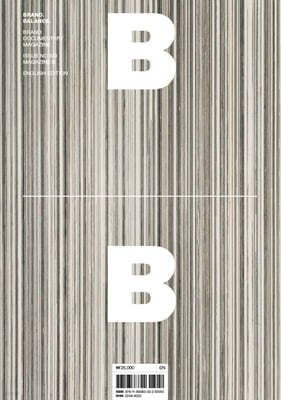
■ About the Publication
Magazine B is an ad-free monthly publication that dedicates each issue to one well-balanced brand unearthed from around the globe. The magazine introduces the brand’s hidden stories, as well as its sensibility and culture, and is an easy but also serious read for anyone with an interest in brands. ■ About the Publisher JOH & Company is a creative company founded in April 2011 by Suyong Joh, former Director of Creative Marketing & Design at NHN. He oversaw and directed the construction of NHN Green Factory, which is the headquarters of NHN, the company that has earned domestic and international reputation as “Google of Korea.” He also created a sensation in the publishing world when he compiled the construction process in a publication, Green Factory. Currently, he leads JOH & Company, a group of creative directors that he has brought together from various fields, and he is conducting complex projects encompassing architectural design, brand consultation, interior, food & beverage service, and product design, based on his own experience. The first fruit of such endeavor is magazine B. ■ About the Issue This month, we introduce Helvetica, a widely used sans serif typeface born in Switzerland. It was the typeface I was supposed to draw for the assignment I mentioned above, and I would say it is one single typeface worthy of careful study even now. The most basic, but also the most sophisticated typeface, Helvetica is perfectly balanced and has a great deal of potential for variation depending on the designer. This explains why, for more than half a century since its creation, Helvetica has been?as it will surely remain?a global graphic design standard. Sometimes Helvetica is criticized for being too rigid or for stifling individuality. But every typeface also has its own merits and demerits, and such criticism is not channeled at Helvetica only. I believe that the aesthetics of a thing, whether it is a small bag or an imposing work of architecture, is determined by having the aesthetic acuity necessary to find balance for a font in a small space. This requires the sensitivity for the fine-tuning of weights, widths, and spacing in a typeface that can be trained down to 0.001 mm. That does not mean that typography has to be approached professionally by a design major. But those who are skilled in designing and employing typefaces are sure to have an outstanding sense not only for design, but for other fields as well. That is because they must have their own distinctive perspective on the content and expressions they are trying to convey. I’d like to recommend that you look closely at well-designed documents and try to imitate the weight and spacing of the typefaces used. I believe even to an untrained eye, this exercise would reveal a new world of type design. |